Story
The aim of this project is to establish a web-based knowledge platform that focuses on the risks and opportunities that arise from the changes in our global environment. My part was to build a new information architecture and navigation concept, create the most relevant wireframes, design the key screens for a HTML click prototype and hold presentations to the communication departments of the Helmholtz Centres.
Research
Results
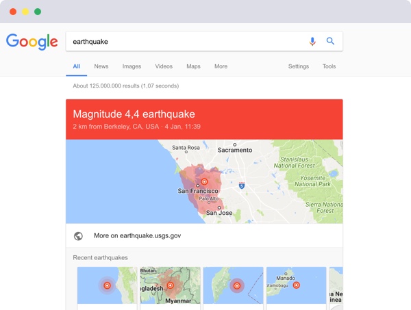
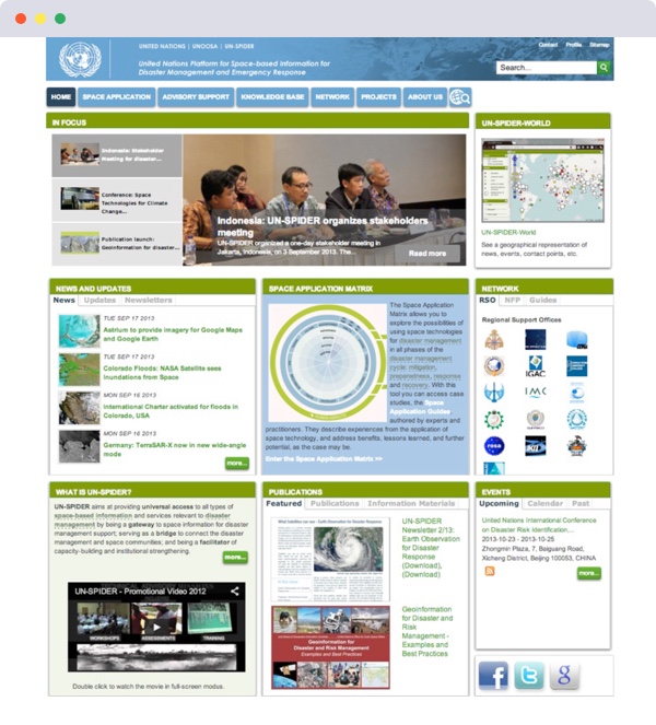
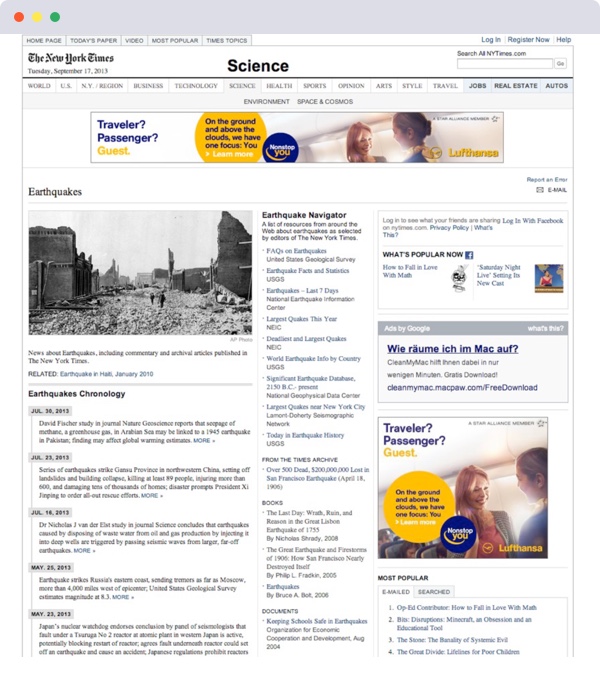
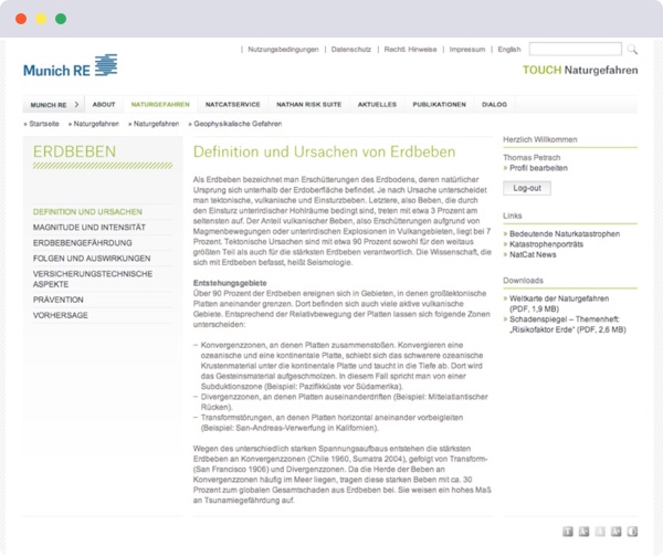
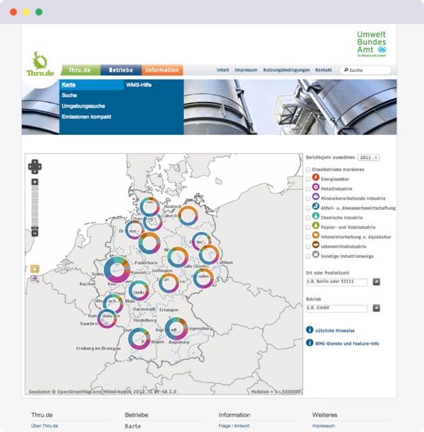
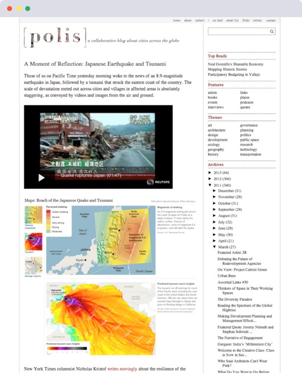
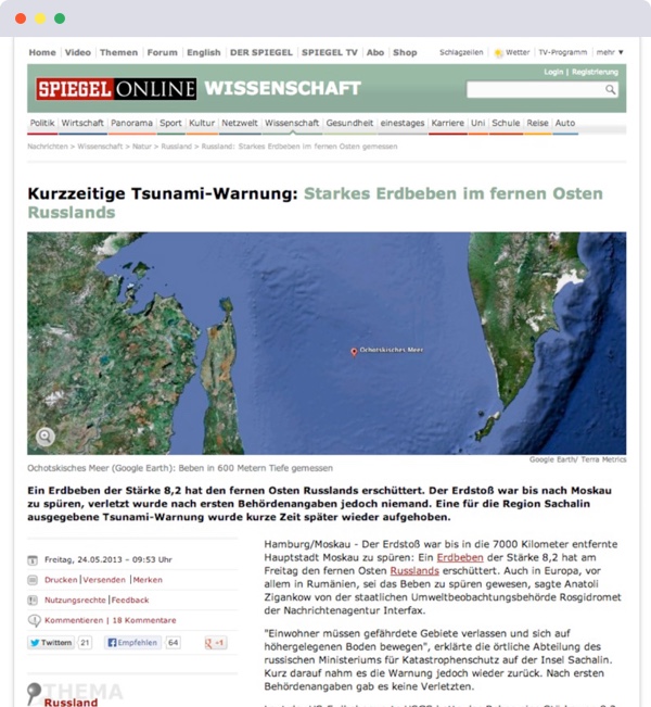
During our research we compared different portals and websites in the science and research field. We noticed that most homepages of these portals are cluttered with text content thus quickly overwhelming the user. Most portals offer a linear filtering, where users navigate through categories—that's why it’s a challenge for users to find the right information easily and quickly. The main problem is that an article does not correspond to 100% of a category name but usually feeds from several categories. Search functions of the portals are often difficult to use, usually represent no content-related references and rarely gave users the desired information.
In recent events such as an “earthquake”, search engines like Google made a better summary than the platforms themselves. Another problem is the presentation of consecutive events, separation of basic and specific knowledge and the lack of reference points to the original article. From a design perspective, small font-sizes of 11 - 12 pixels affect the readability of the content. The results of the research phase gave us a good insight into science platforms and formed the basis for further work.
HTML-Prototype
Usability Walkthrough
As the project proceeded we worked on initial ideas, wireframes and finally we created the HTML prototype. Our prototype and ideas are based on a set of assumptions – that's why it was important for us to test those assumptions in a user test. After the test, we presented the results to the research center. It was interesting to see that our idea of a dynamic filter worked well. In contrast, problems arose when terms like “basic knowledge or ESKP” were not understood or not simple enough.
Sometimes the best design change isn’t a visual or interaction design change; it’s the improvement of a button’s text or a form input’s label.Randy J. Hunt, Product Design for the Web
Semantic Differential
At the end of the test, we we let our test subjects evaluate their affective attitude to terms of attractiveness, ergonomics and trustworthiness. It turned out that the portal creates too little personal reference.
Mobile UI
Later, we optimized the portal for tablets and smartphones. Overall, the portal is designed to encourage people to browse, scroll and explore. Issues like natural hazards, climate change and pollutant should be made more accessible to an interested public, politicians and social researchers, which is highly desirable in the current political situation.